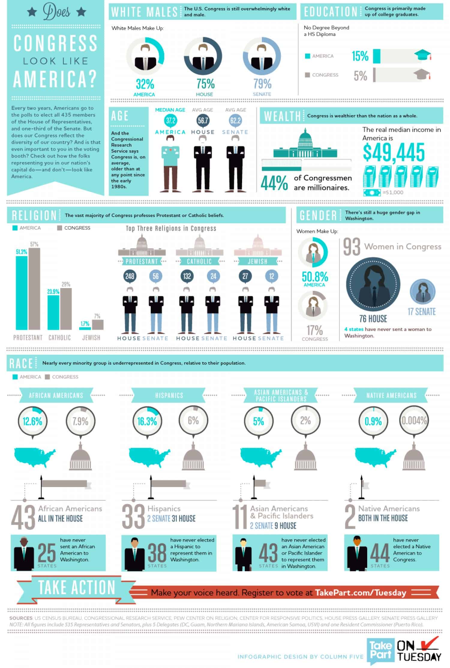
When someone says “member of Congress,” what image comes to your mind?
Visualizing Poverty Across America
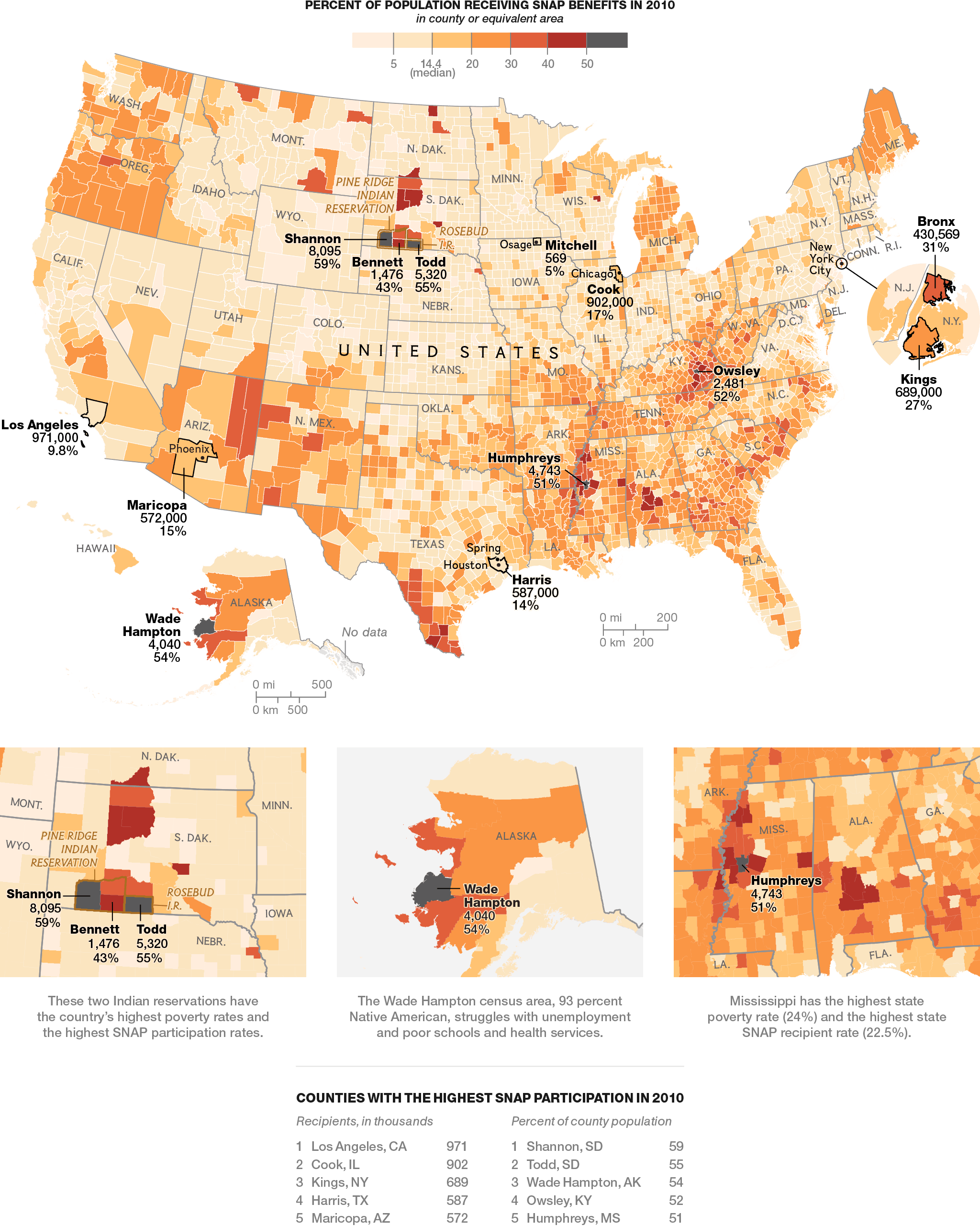
Looking at maps can tell you a lot about a country- how people are distributed, or where population growth is concentrated, for example. One of the starkest visuals, though, is a map of hunger and poverty across the United States, as illustrated by SNAP benefits usage.
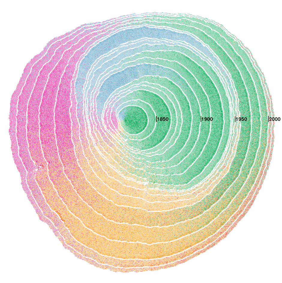
What If Immigration Waves Were Tree Rings?
Dendrochronology may be the most interesting word you’ve never heard before: it is the scientific method of dating tree rings to the exact year in which they were made, which is how scientists determine the age of our planet’s oldest trees. What if this fascinating niche area of science could be used to visualize consecutive waves of immigration?


