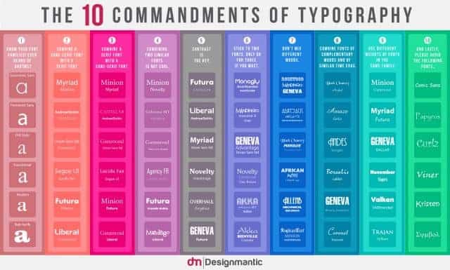
Typography is a big deal. Whether you’re looking for the perfect fonts to use in a resume, or trying to decide which contrasting fonts will work together for an advertising campaign, the right typography can convey many different messages. I’ve been focusing on typography recently when it comes to art projects. (I like to paint quotes on canvas, and give them as gifts.)
Seriously though, when it comes to all types of design projects, the wrong font can ruin the whole thing. Believe me, if you’re still using Comic Sans, no one is going to take you seriously. The good news is that many people understand the importance of the fonts you choose, and some of those kind souls come up with handy tips to help out when you’re stuck in a rut. Looking for ways to ‘wow’ them with your resume? Start by experimenting with typography techniques. Choose contrasting fonts, but never more than two. Try combining a serif font with a sans-serif font, or vice versa. You’d be surprised how using two different fonts can spice up even the simplest of documents.
And if these 10 commandments aren’t enough for you, check out this infographic for even more help.
[via]
Click the infographic below to enlarge:

